

Coca-Cola and So Much More


GOODS
& COCA-COLA
Project Type
Services
Industry
The Coca-Cola Company approached Goods & Services with a refreshing challenge—to brand them as a total beverage solution company.
Highlights
 Created a portfolio brand for Coca-Cola's total beverage solution strategy
- Developed a strategy that connected Coke's legacy visual assets to a portfolio strategy
- Designed a unified design system under the umbrella of "Made by The Coca-Cola Company"
- Demonstrated how to activate the new brand across a series of channels and touchpoints
A Drink for Every Occasion

Coca-Cola came to Goods & Services in search of a new kind of branding approach, one that would help convey to the public that the company was more than just Coca-Cola the iconic drink.
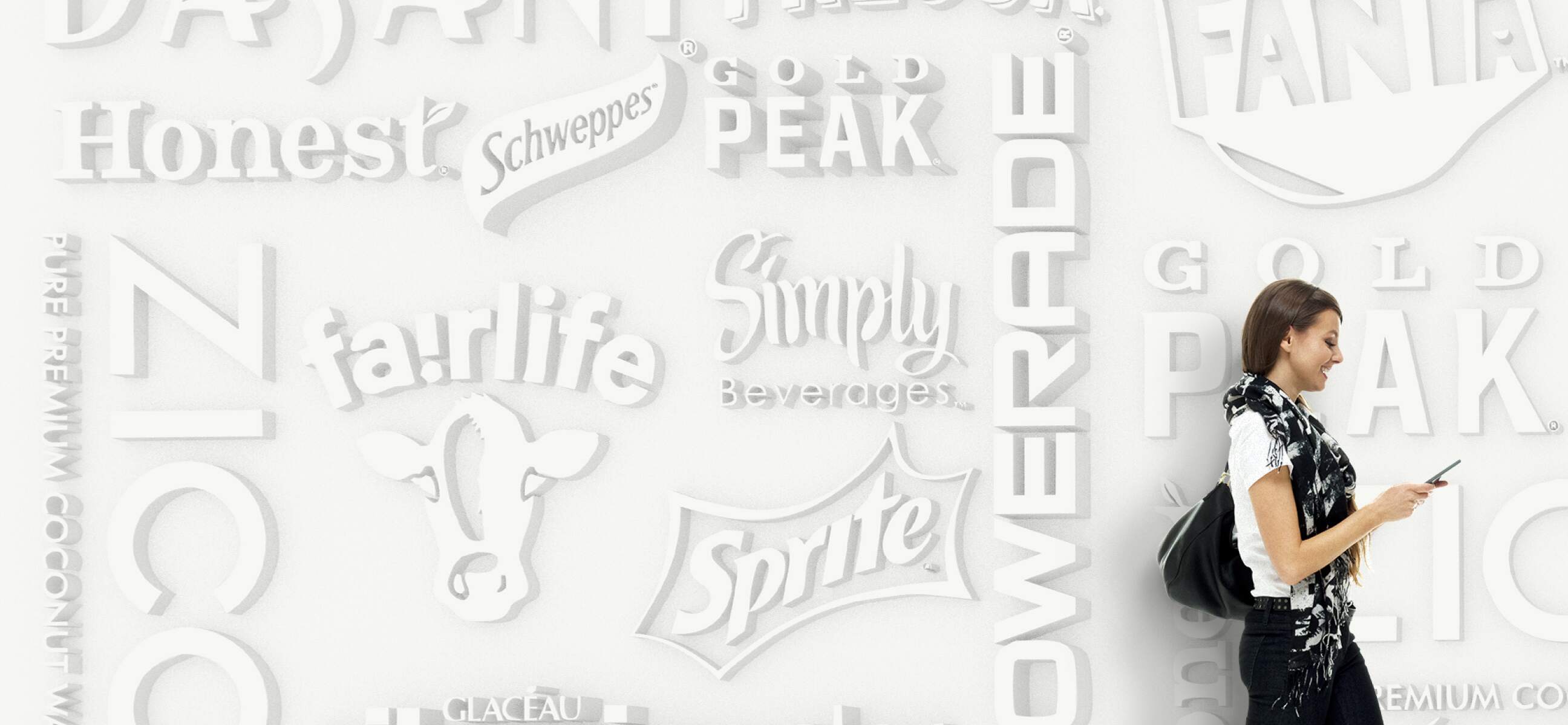
Over decades The Coca-Cola Company had evolved into the largest beverage company in the world, with a huge suite of products that today includes Topo Chico, Power Aid, SmartWater, Aloe Gloe, Costa Coffee, and many many others.
Our charge, which we eagerly accepted, was to provide Coca-Cola (the company) with a comprehensive set of branding tools, overall strategic guidance, and an innovative visual identity system that effectively represented how these new product lines lived individually and in relation to the larger entity, to establish it as a “total beverage company.”


Beverages and Experiences Made by The Coca-Cola Company
“We needed to figure out a way to connect all those brands, as well as the new ESG values, under the larger Coca-Cola Company umbrella, while not treading on Coca-Cola the drink’s iconic brand equity”
Many of Coca-Cola’s offerings are well known, even with cult followings in the health and wellness space, but Coca-Cola is still thought of by many as Coke, Diet Coke, and Coke Zero. In actuality it’s also Odwalla, Fairlife Milk, Vitamin Water and many other delicious—and yes, even healthy—options.
With so much to offer, the company’s overall messaging was getting diluted. So they asked us to figure out a way to connect all those brands, as well as the company’s new ESG values, under the larger Coca-Cola Company umbrella, while at the same time, not treading on Coca-Cola the drink’s valuable brand equity.

That meant attempting to condense, distill, and simplify the many disparate style guides of hundreds of products into a single cohesive Coca-Cola Company brand system. Essentially, to create a flexible modular identity toolkit that could adapt dynamically across Coke’s suite of products to inform and enhance the overall customer experience.
No easy task, and one that Coke has been thinking about—and working on—for years. Such a new system for so many products had to do a lot of heavy lifting. It needed to address a variety of challenges across a multitude of touch points and experiences, communicate personality, engage with the public, attract and compel new consumers, and even adhere to production requirements. What some might consider the Holy Grail of branding challenges.
Continuing the Red Thread


To its credit, Coke encouraged us to ask as many questions as we could think of and workshop as many smart and creative ideas as possible. An opportunity that we ran with, presenting volumes of work over the course of the project.
Ultimately, the solution we created was a series of overarching branding concepts and a portfolio of visual identity systems that highlighted five main needs of a prospective beverage drinker.
“Very few companies can say the’ve been asked to rebrand The Coca-Cola Company. We are thrilled to have been given the opportunity and honored that they trusted us at the level they did. We’re excited to work with them again, any time.”
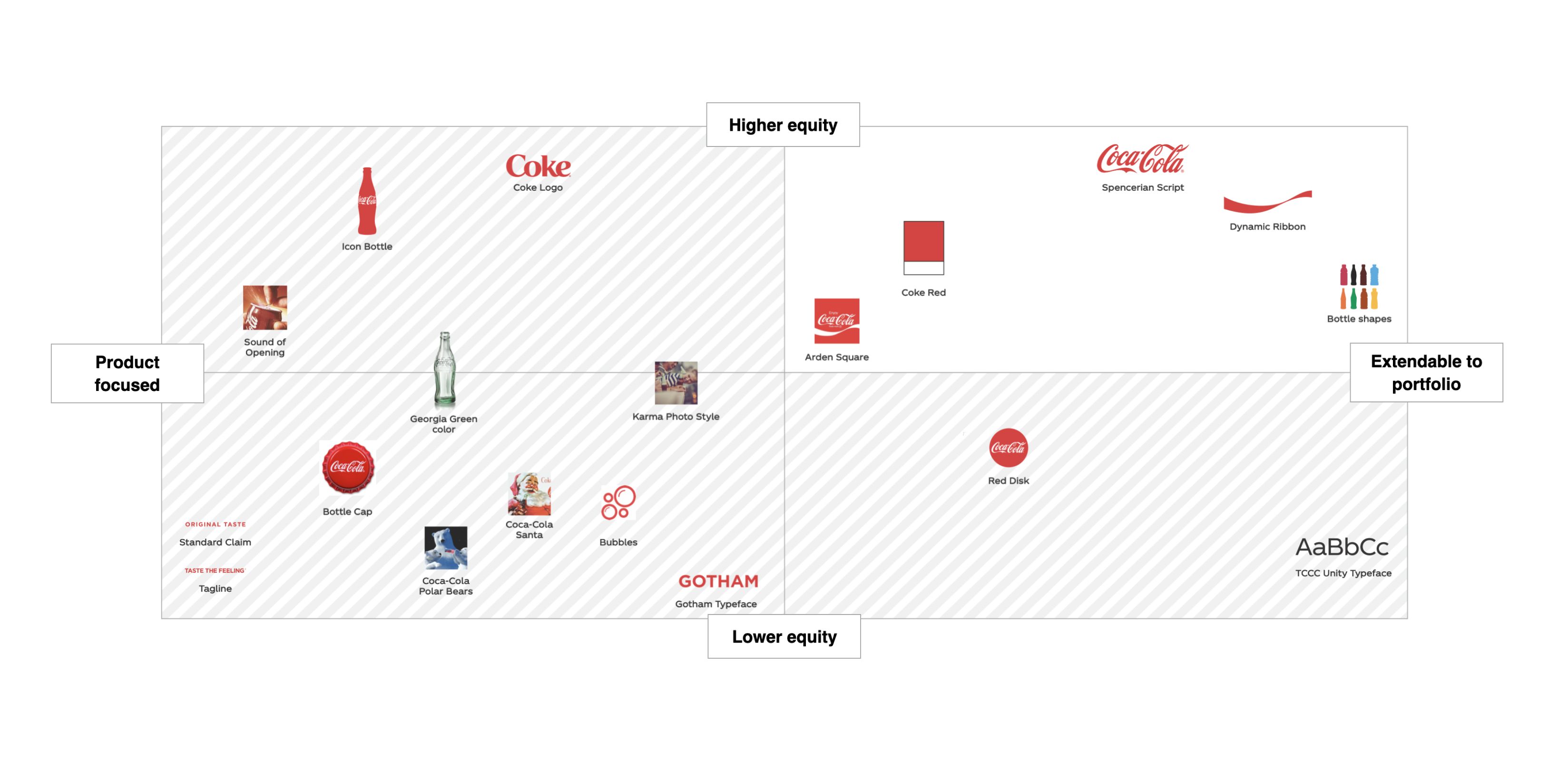
We developed branding tools, including targeted color ways, bold graphic devices like lines and frames, and photo editing styles, all of which focused on—and uniquely positioned—individual products under one larger Coca-Cola portfolio, highlighting each one’s functional and emotional benefits along the way.
For example, to distinguish the hero Coca-Cola beverage from the broader Coca-Cola Company, the beverage would remain in the primarily red color, while we assigned an antique white color with spots of red for The Coca-Cola Company.
To connect an individual beverage to the overall Coca-Cola lifestyle brand segment, we showcased artfully cropped photographs of people enjoying everyday moments with Coke products in hand, helping to illustrate how each of Coca-Cola’s separate offerings intersected with and enhanced that lifestyle. And, because each single product contributes to the totality of the Coca-Cola brand, each one has a unique and important role in contributing to those iconic Coke moments.


We also invented “refreshment cues” that worked at corporate and local levels, and immersive experiential initiatives like wrapping products like vending machines, trucks, umbrellas, ice buckets, and bottles in Coca-Cola signage.
This new holistic approach allowed Coca-Cola the drink and Coca-Cola the Company to live comfortably together under one roof, alongside the many other members of the extended Coke family, underscoring that, at the end of the day, the Coca-Cola brand was Coke and So Much More.
.png)